UX/UI for new healthcare payment platform

When Medicare had 13 months to launch a new data platform for every pharmacy in the US, I designed high-impact improvements that supported a successful release

Sr. UX Designer

Role

Healthcare Data Platform Launch

Project

A1M Solutions

Company

2025

Year

Massive Scope on a Hard Deadline

In December 2025, the Centers for Medicare and Medicaid Services (CMS) began preparing for a law that limits how much Medicare beneficiaries can be charged for certain drugs. To prevent pharmacies from operating at a loss, the law required manufacturers to issue refunds whenever those covered drugs are dispensed to a Medicare beneficiary. Understanding that this created a significant logistical challenge, CMS decided to build a new system for tracking and coordinating refunds to every pharmacy in the country. They called it the Medicare Transaction Facilitator (MTF) and we had 13 months to build it. 

I joined the MTF team shortly after the project began. The looming deadlines had pushed engineers to already start building, but without design resources available, these engineers were forced to make core decisions about how the tool should operate as they were building it, often with little sense of how each feature connected to the broader project. Consequently, I inherited an interface with some major usability pain points and an engineering team with little capacity for revisiting any of their prior work. If I wanted to be an asset on this project, I knew I would have to be very intentional about which changes I recommended and very confident about my solutions.

Problems Worth Addressing

The challenges of building the MTF weren’t just about preparing for volume. One of the tricker aspects was creating a single system that worked for three, very different kinds of organizations: pharmacies, manufacturers, and Third Party Support Entities (companies contracted by pharmacies and manufacturers to run various operations). Beyond providing framing that made sense from these different perspectives, we had to create a solution that respected the various ways these entities operated. A single independent pharmacy is a very different beast than a national chain like Walgreens or CMS, and different still from a pharmacy that operates as part of a larger institution like a hospital.

As our design team became familiar with the aspects of the application that had already been established, one issue rose to the top of our attention: supporting users with multiple organizations  (e.g., different locations within a parent chain). The initial build allowed users to be a part of multiple organizations and switch between them, but with two major pain points. The controls for switching between organizations were hard to find and out of sight when users needed them most. 

When users were looking up refunds, managing users or updating enrollment details, there was no way to tell which organization they were interacting with. The only way for users to identify their current organization or switch to a different one was to visit a page called “My Account”. 

Since the MTF was being built to create a shared source of truth that connected operations at pharmacies and manufacturers, these issues created real risk. If a user couldn't confidently understand what information was being displayed in the application, it didn’t just increase the risk of making mistakes, it undermined the entire purpose of the product. And that was a problem worth addressing.

The MTF needed a way to ensure users could always identify which organization was selected and easily switch between available options. So I set out to design one.

Constructive solutions

Given switching between organizations, workspaces and accounts is a common need in SaaS products, I started my search for a solution with a competitive analysis. To set myself up for success when I would eventually pitch my ideas to stakeholders at CMS, I focused my analysis on tools the stakeholders already used and trusted, like Slack, Jira, Confluence and Google. Then, I rounded out the investigation with other well known products like Figma, Shopify and Notion. The competitive analysis surfaced two dominant patterns for switching between organizations: 1) selectable avatars; and 2) text-based dropdowns.


var(--variable-GMXMXUpPB)
var(--variable-qY6Mh08_M)

Common patterns for switching between organizations


In our case, the choice was clear. The selectable avatars pattern relies on users recognizing what those avatars represent. Our users needed the ability to switch between hundreds of organizations with similar characteristics (e.g., various pharmacies or branches that were all children of the same parent organization). To complicate things further, our organizations didn’t all use the same type of unique identifier: one organization might be distinguished by a chain ID, another by a payment center ID. That meant users would need a decent amount of information to identify which organization was currently selected, or to distinguish between available options. Only a text-based dropdown approach could provide enough space for that complexity without eating up valuable space on the rest of the page. Adding a text-based dropdown to the application header was also much more conducive to extending the UI that had already been implemented.

Building Confidence Through Clarity

Once I had decided on using a text-based dropdown in the application header, I dug deeper into exactly what that text should be. In most products, users only switch between analogous items (e.g., accounts with different names), but the MTF was more complex. Pharmacies come in all shapes and sizes. National Provider Identification numbers are sufficient for distinguishing between independent pharmacies, but large chains, like CVS and Walgreens needed more granular identifiers, like branch and location numbers. Since independent pharmacies don’t even have branch or location numbers, there was no way to create a system where a single type of identifier works for all organizations. The only choice was using whichever identifier was appropriate for each organization. 

Since I knew the MTF would be the first system of its kind (new concept, operations, new user base), I opted for addressing the challenge of working with multiple identifiers by being as explicit as possible. Rather than just displaying identifier values (typically a seven to ten digit number), I used a label to convey what type of identifier was being used.


var(--variable-sIH7b7Qf2)

Explicit labels ensure users understand which type of ID is being used


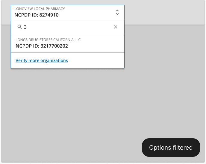
Next, I turned my attention to the nuances of the dropdown interaction. Even if the labels made items in the list easy to recognize, I still had to make them easy to find. Some users needed to switch between hundreds or even thousands of organizations. Scrolling through a dropdown list of thousands would be miserable, but I didn’t want to lose it completely, because it was an easy way to give users a sense of what options were available to them. A classic type-to-jump interaction was also ill suited to list items with multiple fields. For example, if a user types a “1” should that check for names or IDs that start with character? Fortunately, I didn’t have to look far for an ideal solution. The US Web Design System (USWDS) already included a combo box. The combo box interaction sidesteps the challenges above, because typing simply filters down the list of options. 


Key states and interactions for dropdown and menu of options


Testing the Right Question

When it came time to validate the design, I built a Figma prototype with a multi-state org switcher component and a series of overlays simulating the dropdown interaction. Our user researcher built it into a broader round of testing focused on information architecture and site navigation. Rather than testing the combo box interaction in general, we leaned on the fact that this was a well-established interaction pattern already part of the USWDS. Instead, we focused on evaluating whether users could use the control to accurately identify which organization’s data was being displayed, and recognize the options in the dropdown menu.

Across sessions, users consistently identified their current organization, located the switcher, and understood the options presented without confusion. Follow-up testing also confirmed something we’d suspected going in: users actively wanted and expected a fast way to switch, not just a way to see where they were.


Implementation and Beyond

After validating the design for the org switcher, I brought the designs back to stakeholders from engineering and CMS. I laid out the significance of the problem and the strategy behind the solution by emphasizing the feedback collected from users during testing. The pitch resonated with stakeholders, and the feature was approved for implementation. 

Once we had buy-in on our concept from leadership, the team collaborated with a UI developer to bring the organization switcher to life as part of updating the overall application header. Along the way, the organization switcher underwent some modifications that allowed it to be implemented with less engineering effort. Specifically, dropdown list items were condensed to a single line and the identifier type label was removed. Although I was concerned about losing the identifier labels, I recognized that the lighter weight option was still a significant step forward and it created a solid foundation if additional work proved necessary. Regardless, we were still able to maintain the core of the solution: ensuring users can always identify the context for the rest of the information on the screen, and presenting them with a familiar control for efficiently switching between organizations. The feature was rolled out as part of the initial product launch in January 2026.


var(--variable-sIH7b7Qf2)

Before vs. after implementation of organization switcher 


After the MTF went live, the team continued to conduct research and monitor user feedback. As our understanding of users deepened, we realized there was another dimension to the user experience that hadn’t been accounted for in the original build or my improvements. Users wanted to do more than just switch between organizations, they wanted to interact with multiple organizations at the same time. For example, when analysts are looking for claims that meet certain criteria, they don’t want to search one organization at a time, they want to search across all their organizations at once. User feedback also highlighted the need for the identifier type labels (eg NPI IDs vs NCPDP IDs) that were cut from the original designs. As of August 2026, our team is revisiting the organization switcher to apply this feedback while shifting the interface to a multi-organization paradigm.