UX overhaul for eCommerce SaaS app

When inefficient workflows threatened to drive cost Humankind clients, I designed new approaches that improved user speed and satisfaction

Sr. UX Designer

Role

Page Builder Experience

Project

Humankind

Company

2024

Year

A Sales Model Built on Speed

Humankind was a B2B product that eCommerce brands used to provide their shoppers curated recommendations. By pairing shoppers with expert consultants brands were able to increase sales and customer satisfaction. The Humankind platform allowed consultants to message with shoppers, assess their needs, and build personalized landing pages with all the products they recommend for a particular shopper. For example, the hair extension retailer Luxy Hair used Humankind to guide individual shoppers to extensions that were the right color and length and texture for their ideal look.

The business model depended on consultants working efficiently: less time per recommendation meant more shoppers served, more sales facilitated, more revenue relative to cost. Humankind had already lost clients who doubted consultants were producing enough sales to justify the expense. Working backward from that churn, the director of product and I traced the bottleneck to a specific interaction: how consultants add the products they recommend to personalized landing pages.

Breaking Down Barriers

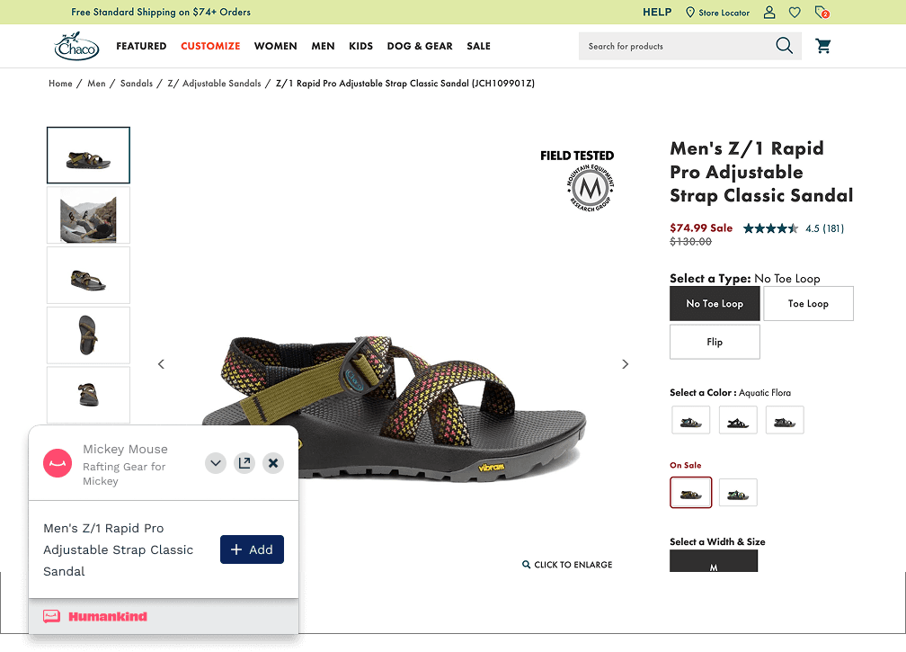
When Humankind first launched, consultants would add products to personalized landing pages via their company’s public website. Every time they wanted to recommend a product to a shopper, they would have to open their company’s website, find the dedicated page for that product, and then use a browser plug-in to add it to the shopper’s personalized landing page. 

Early feedback from consultants highlighted challenges with this approach. The public-facing website wasn’t designed for these kinds of tasks so using it this way required consultants to navigate through inefficient pathways that were littered with pop ups, promos and other content that just got in their way.

On top of that, the building process was very rigid. There was no way to reorder products without removing and re-adding them (a real problem for skincare clients, who made up a large share of Humankind’s roster and used recommendation pages to sequence multi-step regimens), and no way to change between product variants: if a consultant added a green shirt but then decided blue would be a better choice, they would have to remove the green one and add it again in blue.

If needed our consultants to build quickly (and we did), the path was clear, they needed a more efficient method for assembling personalized landing pages 

One Interface for Every Catalog

When it came to eCommerce companies with small catalogs, the solution seemed pretty straightforward. One user even asked for it directly: “Can I just have a list of products to select from?” However, once I started thinking about companies with more robust catalogs, I realized we would need a more nuanced solution than just a simple list. Most products come in multiple variants, which causes the list of offerings to balloon rapidly: a shoe that comes in 10 sizes, 8 colors, and 2 widths may have as many as 160 variants.

The company also didn’t have the engineering capacity to build a bespoke interface per client, so whatever I designed had to work for a consultant recommending something simple with recognizable values (e.g. a small vs. large bottle of lotion) and a consultant recommending a product with many unfamiliar values (e.g. a shoe that comes in 24 colors with names like “Ariel Bronze” and “Tetra Moss”).

Looking Beyond the List

I moved into competitive analysis, looking at how other products handled large catalogs with many permutations. I considered options both inside and outside the eCommerce domain, including Shopify, Wix, Salesforce, Figma, and Canva. Two patterns kept showing up: hierarchical, expandable lists that drill down to specific variants, and a canvas-based model where users add the parent-level item and then configure properties to arrive at a single variant.

I favored the canvas approach because consultants were already following an interaction pattern where they selected a parent-level item and then configured its properties; this would simply give them a more efficient way to do so. My decision was confirmed when my counterpart in engineering shared that it would be a lighter technical lift and better suited to searching and filtering.


var(--variable-GMXMXUpPB)
var(--variable-qY6Mh08_M)

Common patterns for configuring variants
(As shown by Shopify and Canva)


Controlling the Canvas

The harder task was deciding how consultants should be able to work with products once they had been added to the canvas. More specifically, how would they set the various product properties (like size and color) that defined a single variant? And how would they control the order in which products were displayed? I started with designing controls for configuring properties because I wanted to have a sense of what was being moved around the canvas before I focused on how it would make sense to move it. 

The central question when it came to configuring properties was: what type of input to use? Since we couldn’t customize around company or catalog, I could only pick one type of control and it would have to be a dropdown. 

Dropdowns weren’t ideal for properties with only two or three values, but there was almost nothing they couldn’t do. They scaled for properties with dozens of values, could carry a thumbnail image when needed, and could even prevent consultants from trying to select incompatible combinations (e.g. a shirt that comes in red and blue at size large, but only blue at size medium).


var(--variable-sIH7b7Qf2)

Benefits of dropdown controls


When it came to controlling the order of products, I stuck with the traditional approach for organizing items on a canvas: drag-and-drop. Despite being a well established pattern, I had one concern. In my personal experience, dragging and dropping while scrolling can be a tricky interaction so I wanted to ensure that consultants could see all (or at least most) of the products they were trying to organize without changing their view. The dropdown controls for each product could take up a lot of height, so I put each product on a card that could be collapsed into a very short state. With the product cards collapsed, consultants had ample space to drag items into a new order and a drop zone gave users a clear sense of where a product card would land.


Recording of interactive prototype used for handoff to developers (recreated)


Looking Before Leaping

Before handing off designs to engineering, I ran a round of usability tests with the same consultants who raised their pain points with the original building experience. The feedback was uniformly positive, so we moved forward with development, but released cautiously. The real risk wasn’t the interaction pattern; it was whether the tool held up against the intricacies of a real product catalog. To maximize confidence before rollout, we ran a closed beta with a consultant from one of our most engaged clients: shadow sessions where we watched her work with liver shoppers over screen share, structured feedback calls, and a running notes doc. Fortunately, the designs worked as expected and her feedback mostly served to increase our confidence and fill up the backlog with further improvements.


var(--variable-sIH7b7Qf2)

Before vs. after update of recommendation builder


Earning Trust One Catalog at a Time

We rolled out the new builder without retiring the old one, so a client-facing failure wouldn’t cost anyone a sale. Consultants responded with enthusiasm, but the strongest signal came from consultants who ran into challenges. Rather than abandoning the new builder, they’d build as much of a recommendation as they could in it, then switch back to the old tool only to add the handful of products the new catalog integration hadn’t caught yet.

Over the next few weeks, we closed the remaining catalog-ingestion gaps, retired the classic builder, and the new experience became the default, staying that way through Humankind’s eventual acquisition.